The best biotech websites do three things fast: they say what the company does in one line, prove it with something a visitor can check, and give each reader an obvious next step. For a startup, that matters far more than design polish.
Key takeaway: The best biotech websites state one idea, back it with proof a visitor can check, and give every reader an obvious next step. A startup can do all three with a handful of pages.
Investors, partners and candidates look you up before they reply. A vague site costs you meetings you never hear about. Here are five biotechnology and life science company sites that get the basics right, and the checklist I would finish before launch.
What makes the best biotech websites stand out?
For an early-stage company, the best site is the one that gets the right reader to the right next step. Awards and motion effects can wait.
I looked at each example below for four things:
- One idea: a headline a non-specialist can repeat after one read.
- A story in order: problem, approach, evidence, then pipeline or product.
- Proof: news, data, publications or backers a visitor can check.
- A route per reader: investors, partners, buyers and candidates each find their own door.
The first point is where most homepages lose people, as I wrote in why biotech websites fail the 5-second test.
Which therapeutics startups tell one story well?
Leyden Labs is a clinical-stage company developing nasal sprays meant to protect the airway against respiratory viruses. Its hero line is “Protection at the Gate”, and the homepage keeps the science at that level.
Below sit three dated news items and an investor section naming its backers, with an investor relations email. It proves two items at once: one idea up top, and a direct route for investors.
Strategy note: Dated news is the cheapest proof a startup has. It tells every visitor the company is moving.
Albatroz Therapeutics develops antibodies against a surface form of the protein Calnexin, for solid tumours and inflammatory disease. The homepage runs the story in order: the target, why it is selective (found on diseased cells, not detected on healthy ones), then two programmes built on one mechanism.
There is one hero button, to the science. It nails the story order, and it shows a gap: no hiring or partnering call to action on the homepage, only a generic Contact link in the menu. A BD lead who likes the science has to work out the next step alone.
What can startups learn from tools and diagnostics sites?
These companies are bigger, but each one solves a problem a startup has from day one.
- Oxford Nanopore: sells nanopore sequencing devices and software. Its homepage cites 20,000+ peer-reviewed publications, then routes visitors by research area and technique. Lesson: evidence people can check.
- Twist Bioscience: makes synthetic DNA. Its page title is “We make DNA”, with “Start order” for ready buyers and “Connect with an Expert” for the rest. Lesson: two honest next steps beat one generic form.
- Cepheid: makes molecular diagnostic tests and the GeneXpert systems that run them. Its homepage has three buttons by role: lab professionals, healthcare providers and health systems administrators. Lesson: a route per reader.
Routing by reader is the item I would copy first. A diagnostics startup with a lab user and a hospital budget holder needs the same split, even on a five-page site.
Where first biotech websites usually go wrong
Most first sites are written for the founders rather than the reader. The science is accurate, but nobody can tell who it is for or what to do next.
Common
A mechanism diagram as the hero, one contact form for everyone, no news since launch, and a team page as the only proof.
Better
One plain line on what you do and for whom, a story in order, dated proof, and a separate route for each reader.
That one plain line is harder than it looks, because it rests on positioning decisions made before any copy is written. This is the part where most teams want a second pair of eyes, and it is where our life science web design work starts.
A finished checklist matters more than a beautiful launch
Here is what I would want in place before a biotech startup website goes live. None of it is design, and all of it decides whether the design works. The graphic shows the eight items I would settle first; the list adds two practical ones at the end.
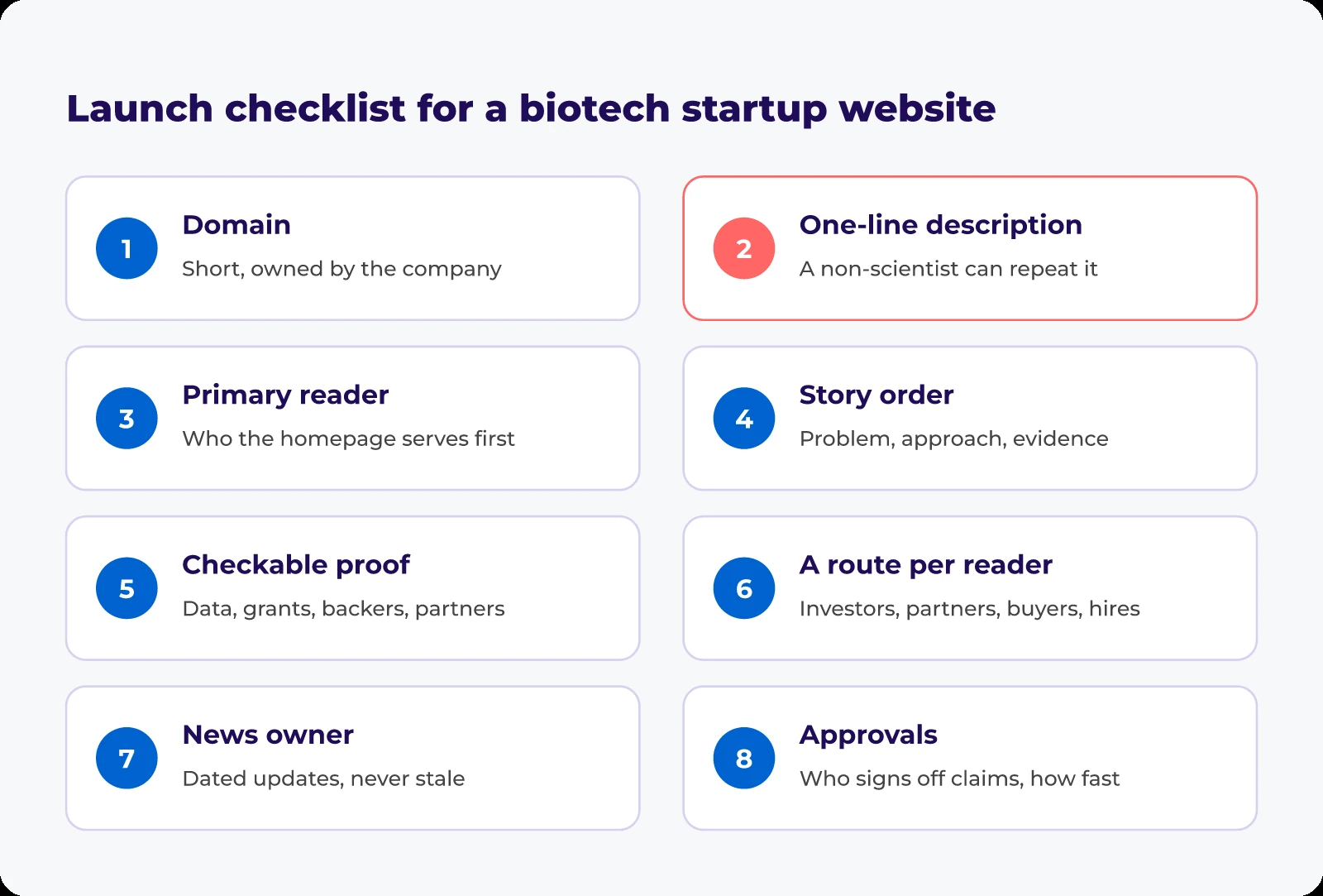
- Domain: short, matching your company name, registered to a company account rather than a freelancer’s.
- One-line description: agreed by the founders and clear to a non-scientist.
- Primary reader: the audience the homepage serves first, with the others named.
- Story order: signed off by your science lead.
- Checkable proof: a publication, grant, data readout, backer or partner, cleared for public use.
- A route per reader: each next step going to a named inbox.
- News owner: one person who posts dated updates.
- Approvals: who signs off scientific claims and legal pages, and how quickly.
- Website assets: logo files, team photos and bios, approved figures, image rights checked.
- Search basics: page titles, descriptions and analytics ready at launch. Our biotech SEO guide explains why.
For the stage before this list, see planning a website project before you build.
A five-page site with every box ticked will do more for a startup than a beautiful one that leaves a partner guessing.
Planning your first proper website? If you want a clear story and the right route for each reader settled before the build starts, let’s talk it through.
Frequently Asked Questions
Most early-stage biotech companies can launch well with five to seven pages: home, science, pipeline or products, team, news and contact. Add an investor or partnering page when you are raising or out-licensing. A small site kept current looks more credible than a large one gone stale.
Show roughly what you would put in a non-confidential deck: programmes, indications and stage. Keep anything unfiled or partner-sensitive off the page, and ask your IP counsel to review new data before it goes on the site.
Often enough that the newest dated item never looks old. My rule is at least one real update per quarter: a milestone, a hire, a publication or an event. A short progress note still beats a news page frozen at launch.
A .com is the safest default for a company with international investors and partners, but a country domain or short variation works if it is easy to spell and you own it. Avoid hyphens, register it to a company account, and secure obvious variants of your name early.